
Montessori Hills School Rebrand

One size doesn’t fit all.
The Hills Montessori School brand has remained largely unchanged since 1978, but the world of education certainly hasn’t. As a school built on individualised learning and a deep respect for childhood development, it was time the visual identity caught up with the philosophy.
The challenge
To craft a brand that speaks to toddlers in nappies, teenagers in high school, and parents juggling lunch boxes and home loans, all while staying true to the values of Montessori learning: self-direction, adaptability, and curiosity.
The solution
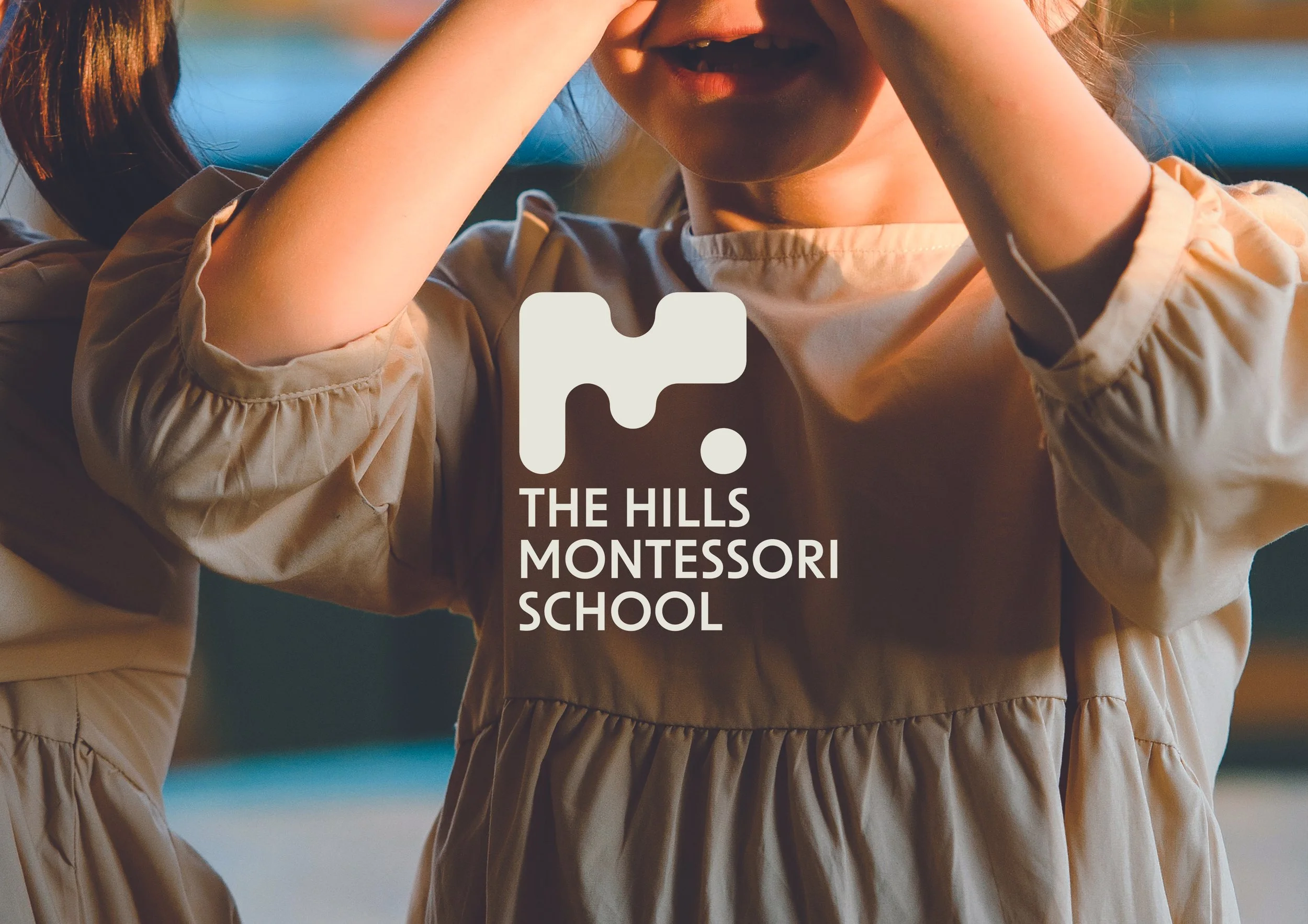
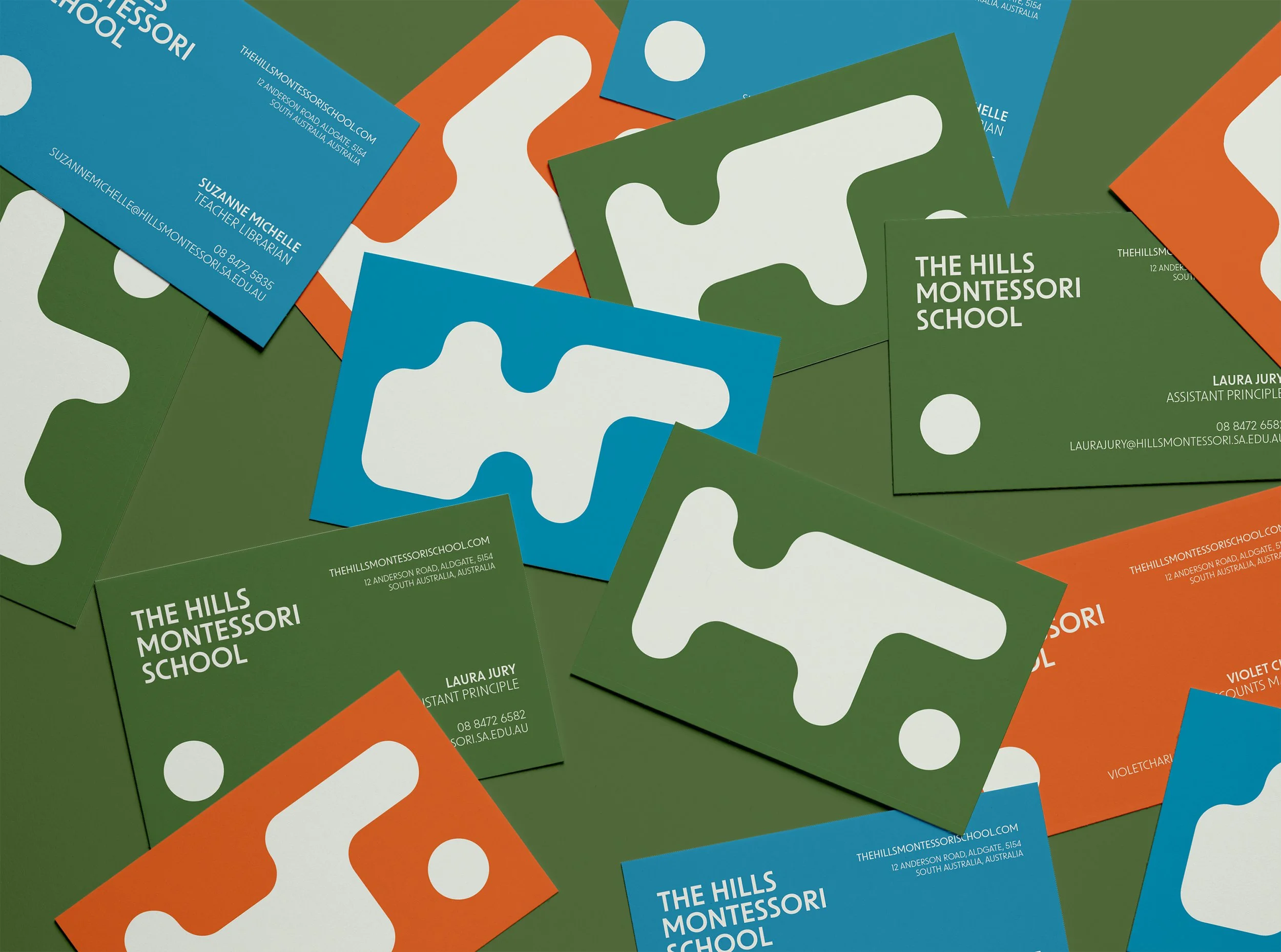
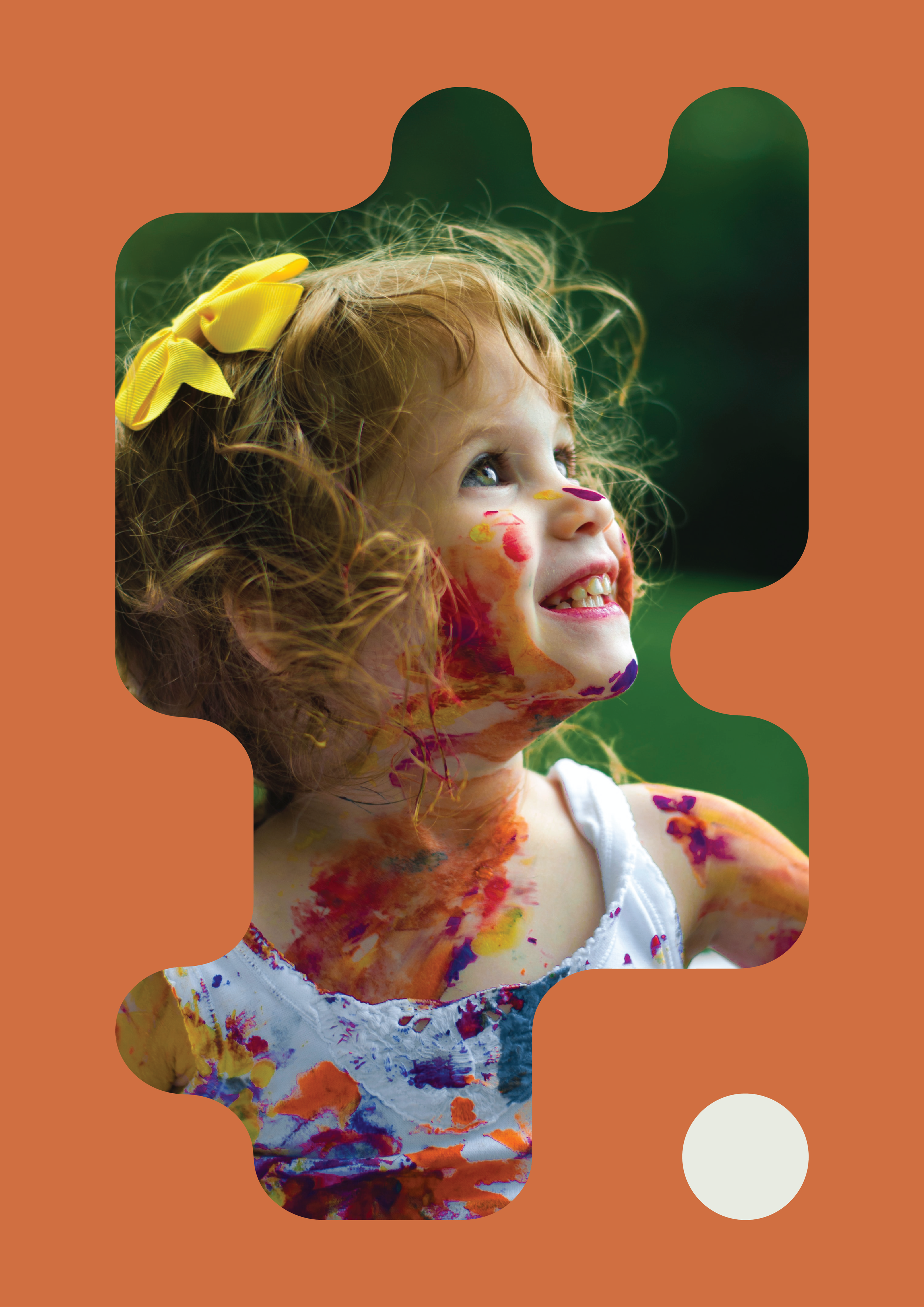
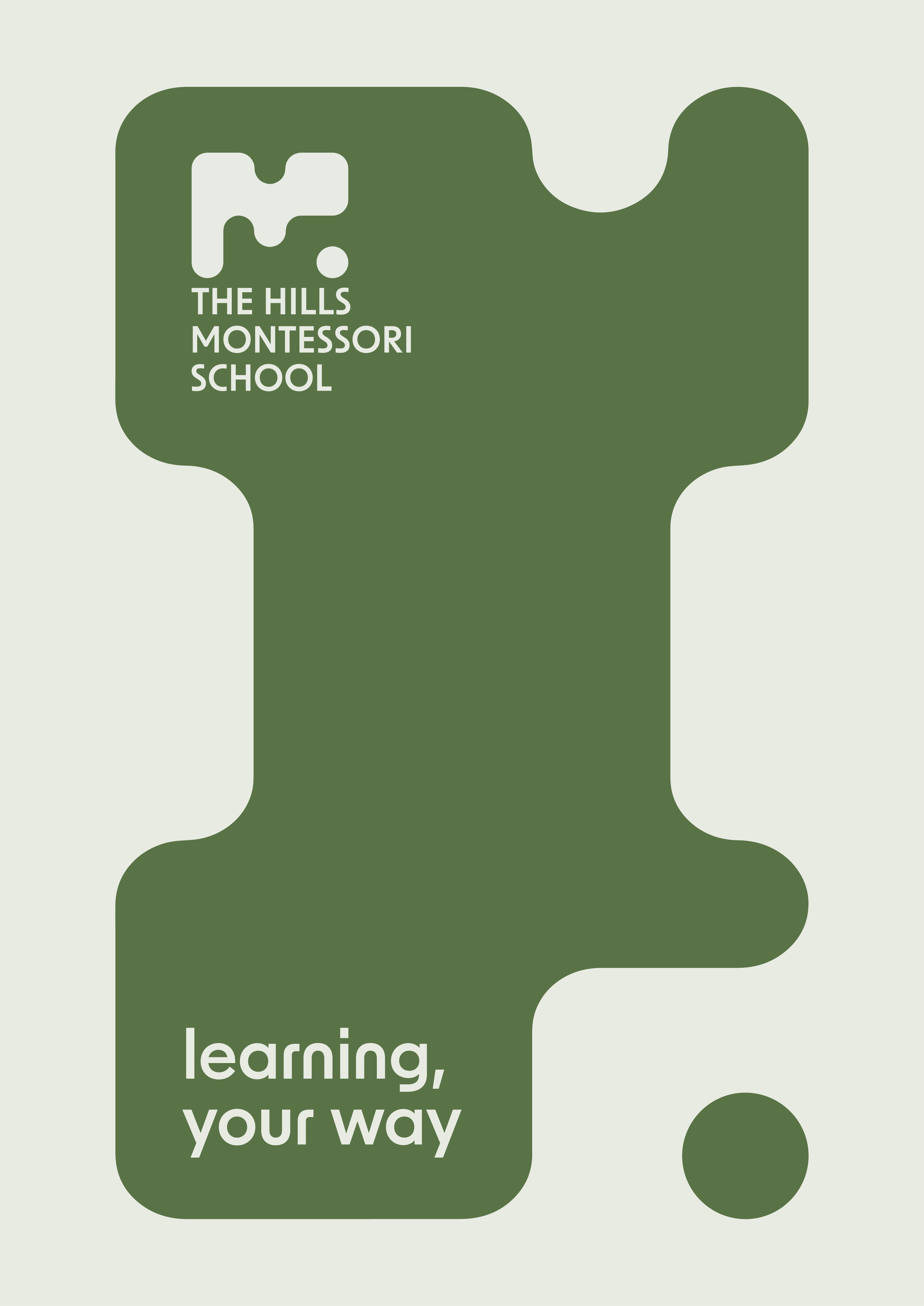
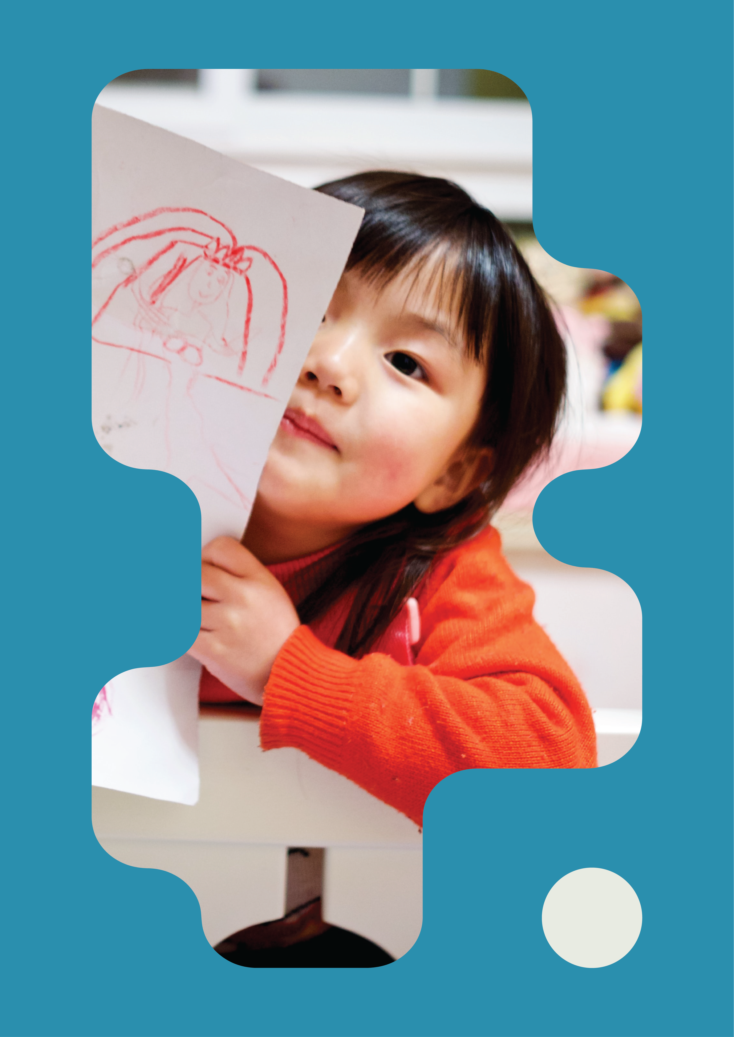
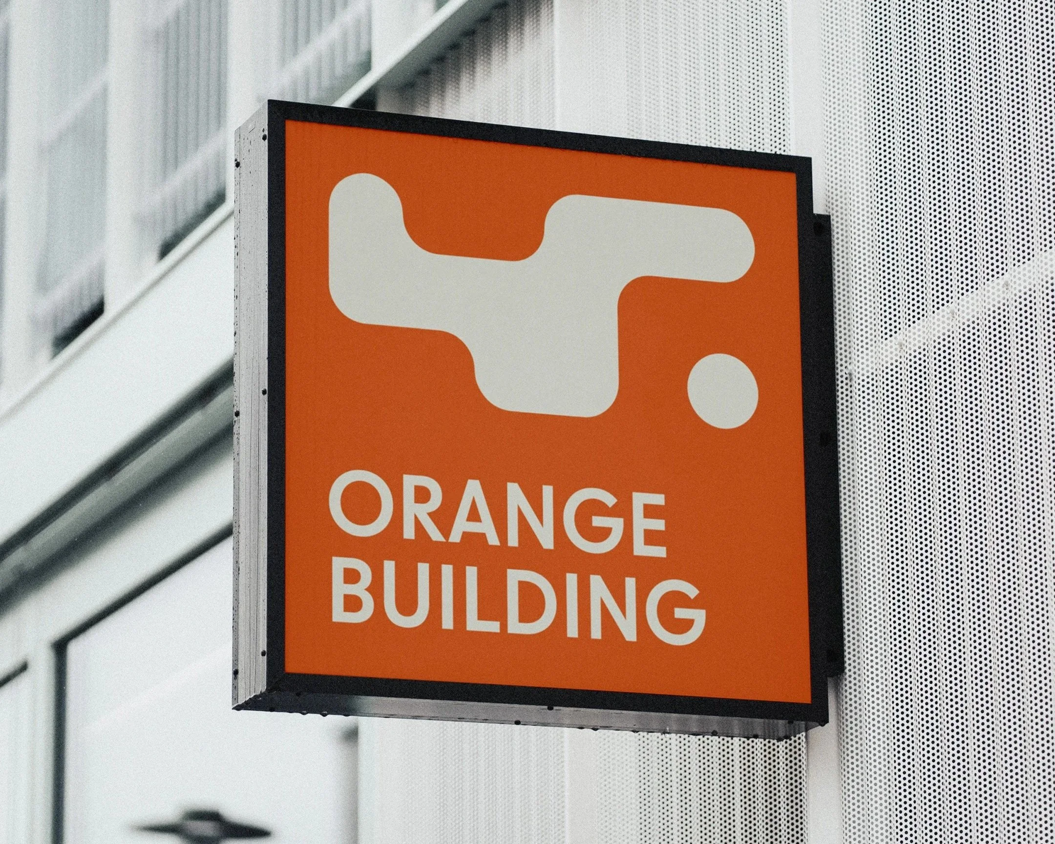
A bold, modular visual language built on jigsaw-but-not-jigsaw shapes, playful, flexible, and symbolic of the unique way each child fits into their own learning journey. These abstract forms shift and reassemble across applications, just like the students themselves, no two alike, and all the better for it.
A calming-yet-optimistic colour palette draws from the surrounding bushland and skies, bringing a grounded, natural energy to the brand. A rounded typeface softens the tone and mirrors the school’s nurturing, inclusive approach.