Cookie-cutter. Standardised testing.
One size doesn’t fit all.
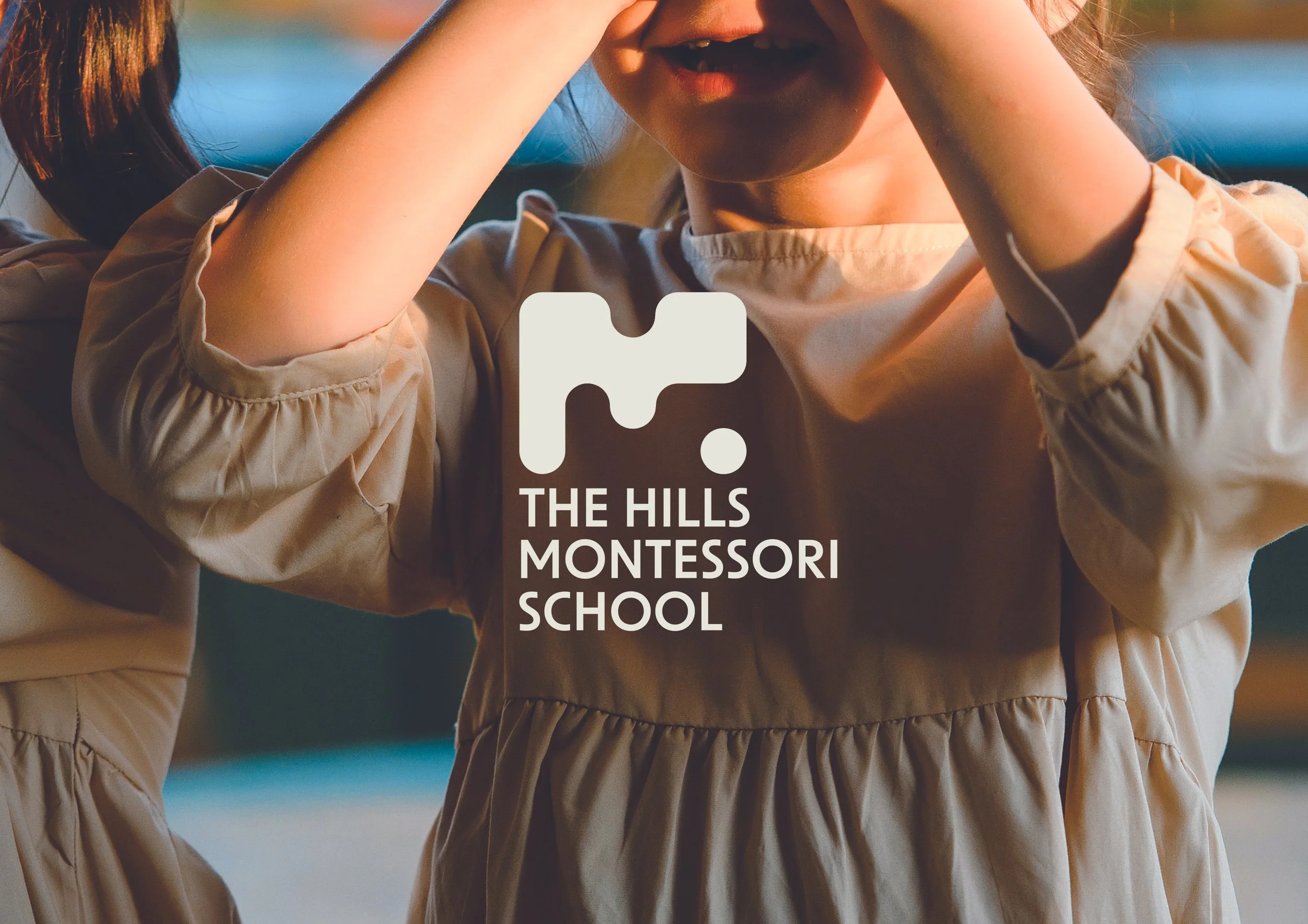
The Hills Montessori School brand has remained largely unchanged since 1978 — but the world of education certainly hasn’t. As a school built on individualised learning and a deep respect for childhood development, it was time the visual identity caught up with the philosophy.

To craft a brand that speaks to toddlers in nappies, teenagers in high school, and parents juggling lunch boxes and home loans — all while staying true to the values of Montessori learning: self-direction, adaptability, and curiosity.
The challenge
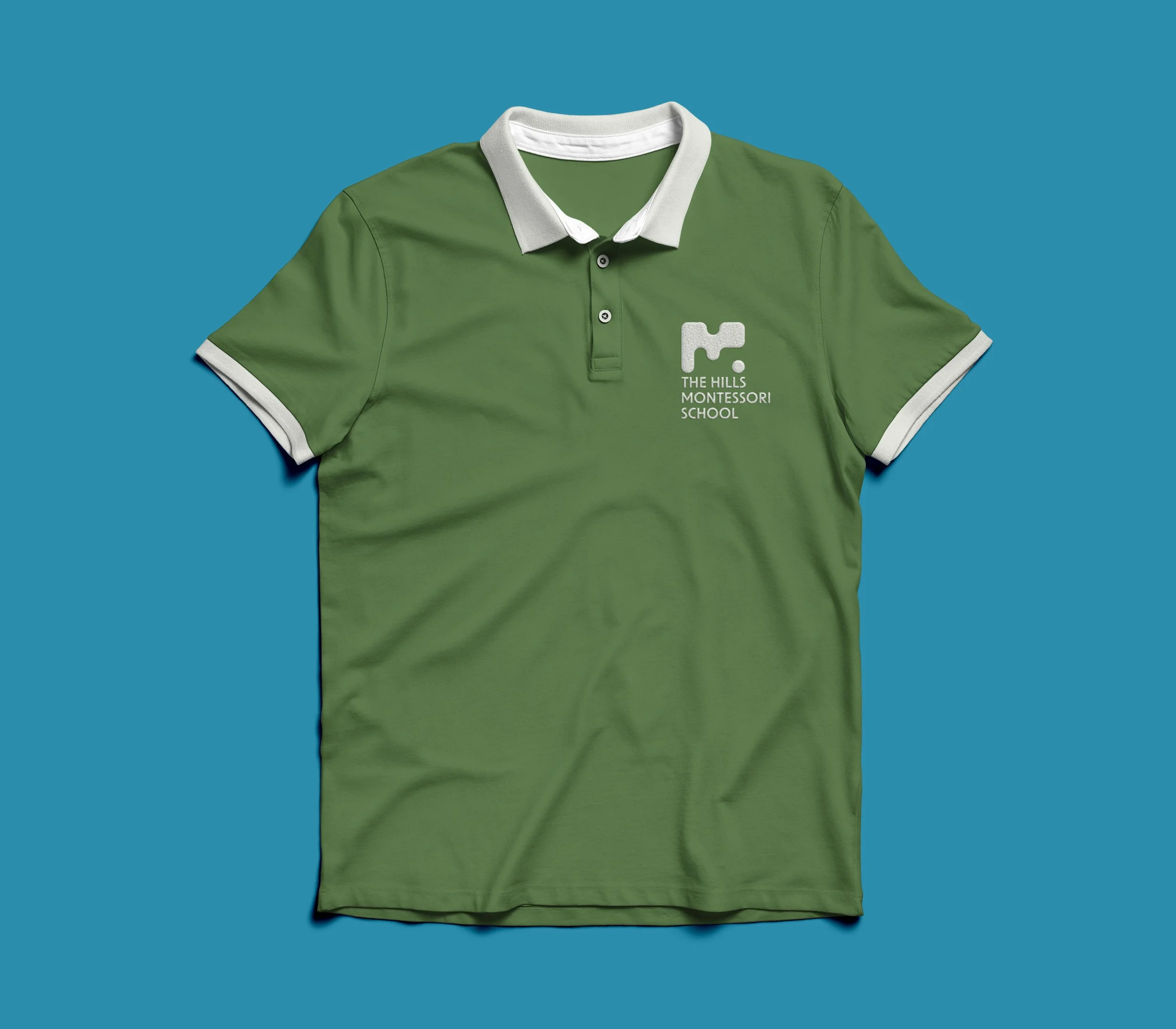
A bold, modular visual language built on jigsaw-but-not-jigsaw shapes — playful, flexible, and symbolic of the unique way each child fits into their own learning journey. These abstract forms shift and reassemble across applications, just like the students themselves — no two alike, and all the better for it.
The solution

A calming-yet-optimistic colour palette draws from the surrounding bushland and skies, bringing a grounded, natural energy to the brand. A rounded typeface softens the tone and mirrors the school’s nurturing, inclusive approach.

This new identity captures a mindset; one that celebrates difference, embraces nature, and reminds us that learning should never be stagnant.