Sorella. Italian for sister.
Also: wine lovers, business partners, childhood wall-scribblers.


Started by two sisters with a deep love for wine and an even deeper love for each other’s creative chaos, Sorella is a brand built on connection, craft, and a little childhood mischief. The goal was to create labels that felt grown-up, but not too serious. Elegant, but still full of heart.
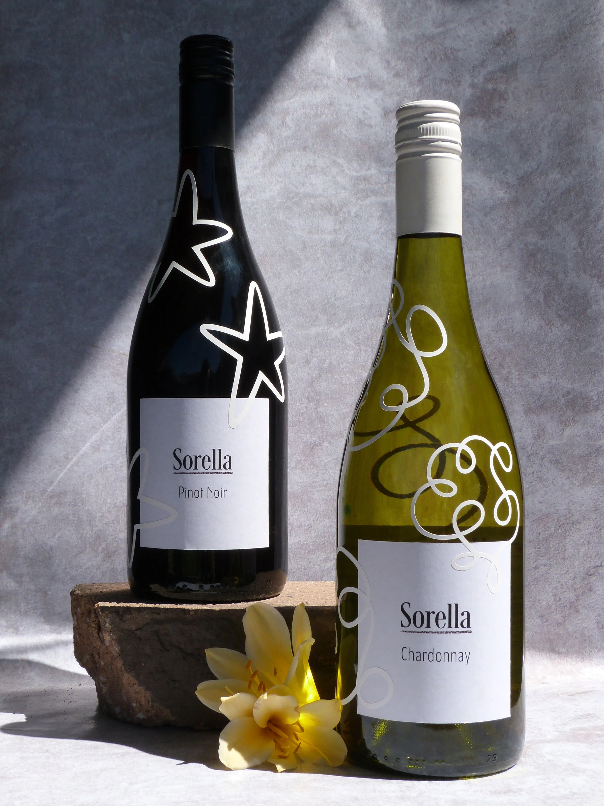
The final design walks that line: sophisticated, with a touch of whimsy. Each bottle features a distinct hand-drawn squiggle — delicate lines screenprinted directly onto the glass, wrapping around the bottle like a memory you can hold. These marks are more than decoration: they’re inspired by the sisters’ childhood habit of doodling on walls, a quiet nod to the unruly beginnings of their creative bond.

The front labels are intentionally minimal, letting the artwork take centre stage. The squiggles change from wine to wine — no two the same — giving each varietal its own voice while tying the range together with a common, playful thread.
The wordmark is set in a clean, modern serif — refined but warm — underlined by a crayon-textured stroke that adds a human, handmade edge. It’s a detail that grounds the design and ties it back to the brand’s origin story: two sisters, some crayons, and a whole lot of imagination.
