Bringing people back to the breakfast table
picniq is a boutique jam brand with one simple ambition: to bring friends and family together over breakfast. Whether it’s a slow Sunday morning or a quick slice of toast before work, picniq celebrates the little ritual of eating together.

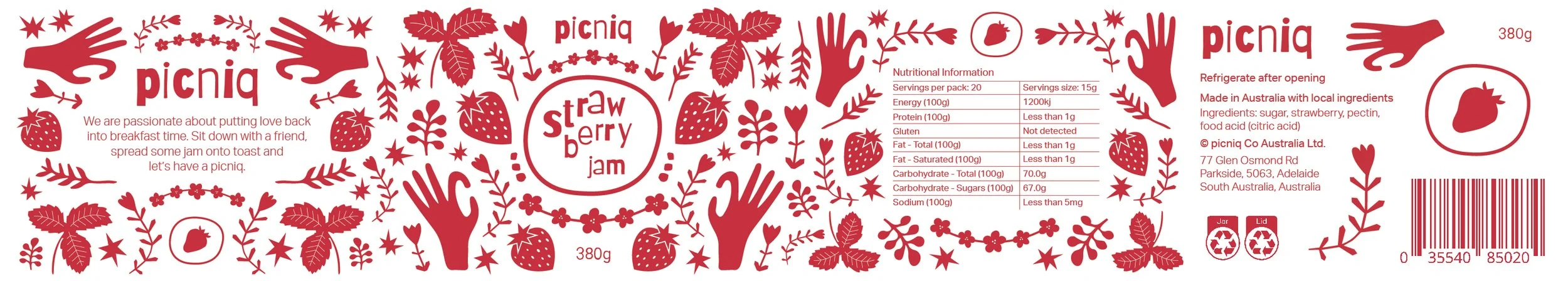
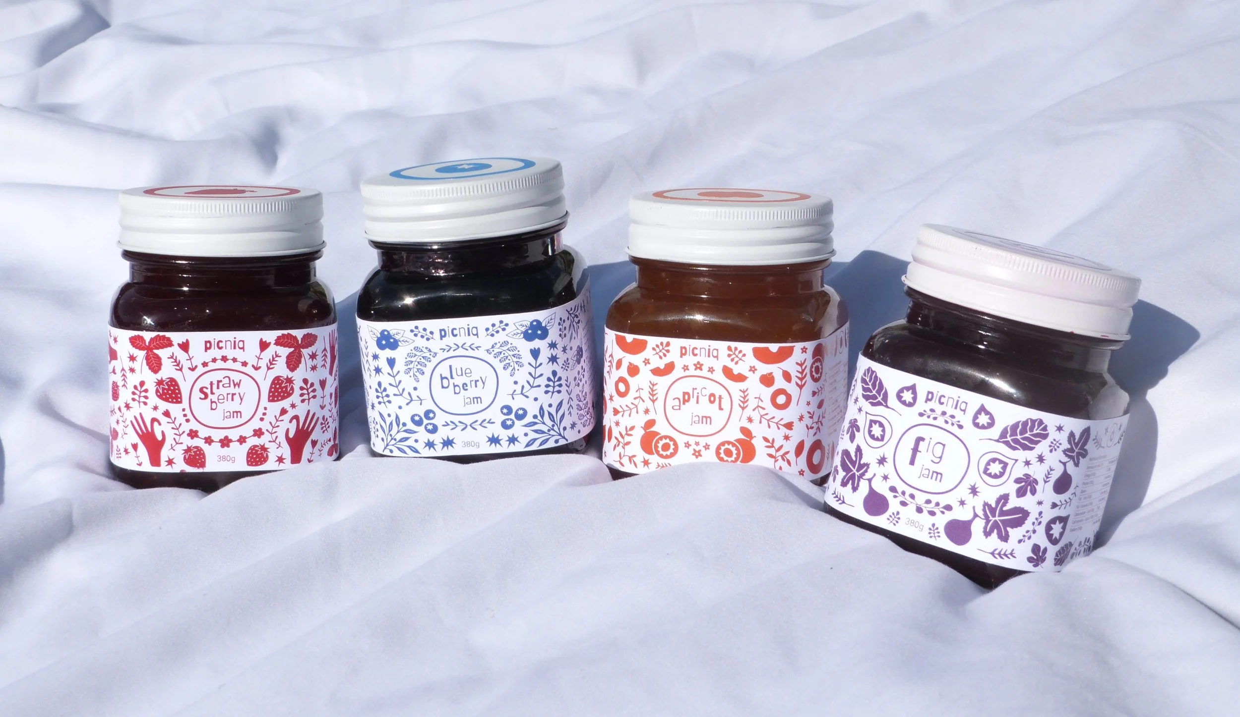
The name picniq evokes a sense of casual gathering and simple pleasures. It also happens to be perfectly symmetrical, which became the cornerstone of the design direction. Every element in the brand identity reflects this symmetry: from the wordmark itself to the illustrative label design.
The wordmark is funky and bold, using a imperfect sans-serif that pairs well with the symmetrical monochromatic illustrations. The typeface is used again at the centre of an imperfect circle, acting as a stamp that proudly declares the jam’s flavour inside.
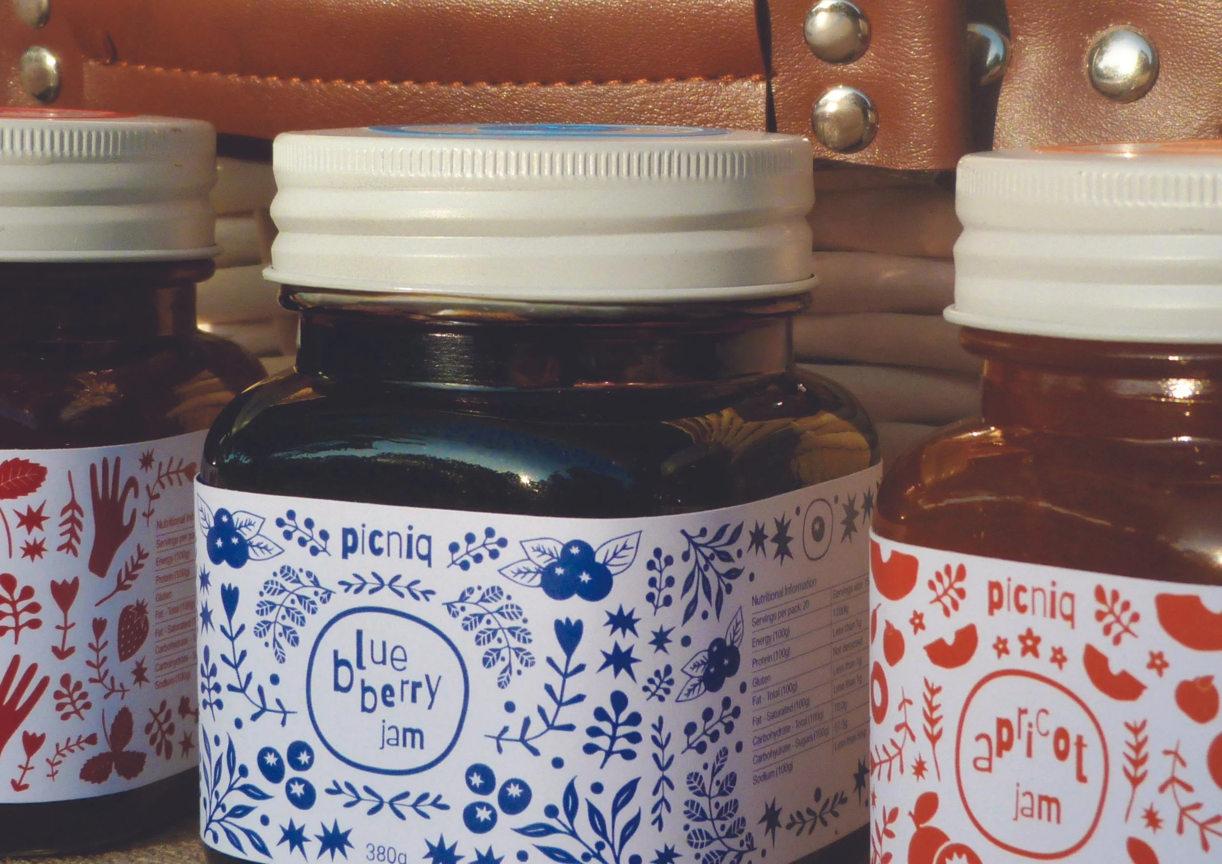
Each flavour features its own unique, fruit-inspired illustration paired with a single-tone colour palette. By using a monochromatic scheme for each jam, the labels strike a balance between playfulness and restraint.
The illustrations themselves are bold and slightly exaggerated. Their symmetrical arrangement — mirrored left to right — ties into the overall identity and gives the jars a distinctive, display-worthy look.

More than just a label, picniq was designed as a conversation piece. The kind of jar you’d gift a friend, bring to brunch, or leave out on the kitchen counter.
The packaging plays into a growing desire for everyday items that feel special. By leaning into symmetry, a monochromatic colour palette, and playful illustration, the jars read as both nostalgic and fresh.